The Worst Language Learning Tool in the World
Building a multilingual and multicolor map of how the world says pistachio
One afternoon, as I was chatting with a friend of mine whose son is allergic to several species of nuts, she half-jokingly suggested her son should learn how to say "cashew" and "pistachio" in every language, and then mused about writing all the corresponding translations on some map of the world.
The idea caught me immediately and I started imagining a colorful world map of pistachio adorned with hundreds of words written in various characters. There was something intoxicating about the idea of capturing the whole world's vocabulary in a single glance — if only one item at a time. It reminded me of my youthful fascination with Giuseppe Mezzofanti, the polyglot Cardinal who allegedly spoke dozens of languages fluently.
Over the next several months, I would come to deeply regret that enthusiasm. Having devoted an excessive amount of my free time to realizing this vision, I am now writing this story with the hope of closing this chapter and moving on to more productive endeavours, but also to warn readers. After all, this might be the world's worst language learning tool.
Two Maps Built, One Dreamed
This idea of a word translation map sits at the intersection of two things I love: language learning and information visualization. And I had a rough sense of how it could be built. Wikidata knows which languages are official where, Wiktionary has translations, and rendering a world map on a webpage has never been easier. How hard could it be to put it all together?
The Geographic Map
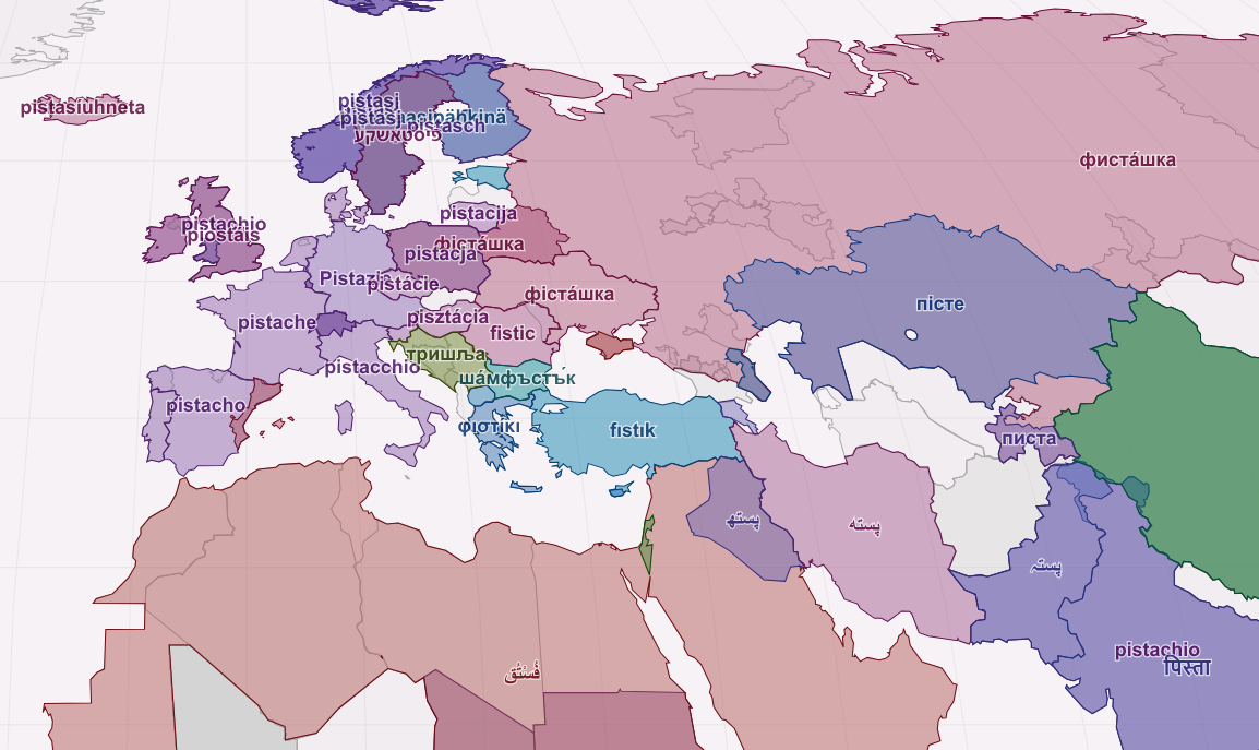
Here is my abridged recipe for creating a geographic map of word translations:
-
Get a list of official languages for all countries and regions of the world, based on Wikidata's official language (P37) property.
-
Fetch GeoJSON shapes for these countries and regions from Wikimedia Commons.
-
Simplify these shapes using the Douglas-Peucker algorithm and merge adjacent regions where the same language is spoken to avoid showing the same Spanish word too many times.
-
Render country and region polygons using D3.js's implementation of the Equal Earth projection, or whatever map projection you find least problematic.
-
Pre-optimize positions of labels to reduce collisions. Things do get crowded in Great Britain for words with translations in English, Cornish, Irish, Scottish Gaelic, etc., but at least full occlusion is avoided.
-
Then, for a given English word:
-
Retrieve meanings of the word and their respective translations from Wiktionary, for as many languages as possible.
-
Color regions with available translations meaningfully, while leaving regions without translations gray. My idea of meaningful colors was that words that sound similar or come from the same root should get similar colors. Determining cognates at scale is currently out of my reach (see The Etymological Flow Map below), and so is calculating the phonetic similarity of words in arbitrary languages. The best I could do was to retrieve transliterations, which reveal little about a word's pronunciation, but have the advantage of being available and allowing strings of characters to be compared. I calculate distances between these transliterations: how many characters do you need to swap, add or delete to get from pistachio to pistache, or to pisutachio (Japanese transliteration)? I then use mathematical optimization to find a set of colors whose pairwise distances correlate with the distances between words.
-
-
Deal with a long tail of edge and corner cases related to the messiness of languages until you give up. Wiktionary language names are not ISO codes, and not always the same as official language names on Wikidata. "Mandarin" needs mapping to "Standard Chinese", "Norwegian Bokmål" to "Bokmål". Wiktionary usually gives translations from English to Serbo-Croatian, but not Croatian, which is the official language of Croatia, etc.
The Bubble Map
While working on the geographic map, I grew increasingly aware of its serious structural flaws:
-
The map gives visual weight to land area, which I believe is a poor measure of a language's significance. Russia's vast territory looms larger than China's, despite having a fraction of its speakers. Canada dwarfs France in Francophonia, etc.
-
The map repeats the same translation for every country sharing the same official language, redundantly showing the same French word over France, Canada, Benin, and the Democratic Republic of the Congo. On the other hand, the map must also deal with overlaps: in Canada, again, and many other countries in Africa and elsewhere.
-
Finally, the map separates related languages (Afrikaans and Dutch), while juxtaposing languages that have nothing in common.
The bubble map addresses all these flaws, by consolidating the representation of each language into a single circle sized by number of speakers and positioned according to its family. Language families, which are represented as nested bubble-like shapes, are taken from Glottolog's amazingly comprehensive catalogue of the world's languages and language families — so comprehensive in fact, that I had to filter it by keeping only languages with over 10 million speakers.
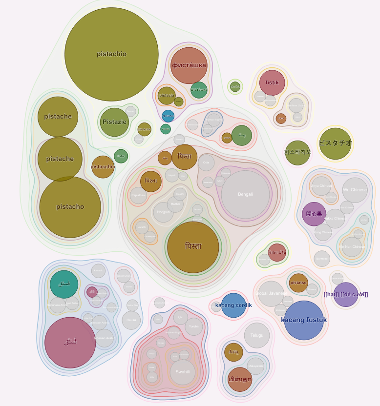
Afrikaans lands close to Dutch, and languages with a high number of speakers appear more clearly. The use of Wiktionary data and the color optimization remain the same as for the geographic map. As do a few nagging questions: how would I use all these words? and where do they come from?
The Etymological Flow Map
One interesting thing about the word pistachio is how it traveled from Persia to England and beyond. The map I am dreaming of would show this, but it does not exist yet.
The etymological map I imagine would be a flow diagram, like Charles Joseph Minard's masterpiece the Carte figurative des pertes successives en hommes de l'Armée Française dans la campagne de Russie 1812–1813, but rather than the attrition of Napoleon's army it would tell the fascinating story of words transmitted across space and time, traveling on the back of trade routes and conquests.
One reason this etymological flow map does not exist is that the underlying data is fragmentary, often disputed, and almost always unstructured. Wiktionary does include etymology sections, but "Reanalysis of French *acajou* as *a + cajou*, from Old Tupi *akaîu*..." falls short of the well-structured directed graph I could turn into a flow map.
A Terribly Bad Idea
Showing where these words come from is difficult, but can we at least use them? Having presented my translation maps, real and imagined, it is now time to take a step back and discuss why this whole translation map idea was such a bad idea.
Terribly Incomplete
Even aside from etymology, the data situation leaves much to be desired.
Minority languages are essentially invisible. Glottolog lists 7,675 spoken L1 languages in 2025. A world map of official languages will cover fewer than a tenth of them.
Even for official languages, Wiktionary coverage is wildly uneven. While there are currently 174 active Wiktionary editions (see List of Wiktionaries), only 71 languages have 10,000 or more definitions (according to Wiktionary:Statistics).
A basic word like bread has 500 translations (for its primary meaning baked dough made from cereals). A word like cashew is translated into 33 languages.
What about the quality of these translations? Surprisingly, this question has attracted little systematic study, but I assume its crowd-sourced nature and lack of chief lexicographer mean it is bound to be uneven.
Terribly Useless
Beyond data limitations, my pistachio map is bound to strip away nearly everything that could support language learning.
Let me count what is missing.
-
No pronunciation. Seeing "腰果" tells you nothing about how it sounds. Seeing yāoguǒ next to it tells you little more. This will not be enough to recognize it in speech or reproduce it in conversation.
-
No grammar. How does кешью decline across Russian's six cases? This question was a trick: it remains frozen, like many foreign borrowings, but the map would not tell you the answer anyway.
-
No context. A word stripped of its sentence teaches almost nothing about how a language actually uses it. Sentences give the language-learning brain hooks: grammar, neighbors, occasion. A word alone on a map has none of these.
-
Lost meaning. Words do not map one-to-one across languages. "Nut" has 17 entries in Wiktionary (a hard-shelled fruit, a fastening fixture, several informal and vulgar senses) and the map, at best, gives you a foreign equivalent for one of them at a time. But this equivalent, in turn, may have other meanings entirely absent from the source word. The Chinese word for pistachio, 開心果, literally means fruit that opens the heart, and carries connotations and figurative meanings the English word entirely lacks. The map is blind to the different ways each language carves up the world.
-
Words are the wrong unit. Firstly, languages of the world do not all agree on what a word is (compare English, German, Mandarin). Secondly, a large proportion of natural language consists of more or less fixed multi-word expressions, and these formulaic sequences, or chunks, are the units that fluent speakers retrieve, not isolated words. See Viktoria Verde's article on formulaic language and why failing to learn chunks and collocations means you will sound off in your second language.
Am I being harsh on my pistachio map? It did help me learn a few words. Funny how the walnut (which from its etymology literally means foreign nut) is the Greek nut (грецкий орех) in Russian, Italian nut (orzech włoski) in Polish and just nut (noix) par excellence in French. In such cases, seeing words in multiple languages at once may have a bit of mnemotechnic value.
Worse than useless, one could argue that the pistachio map is harmful for language learning because it favours distraction over immersion, the most important prerequisite for solid language learning.
Conclusions
I have made peace with this word map and what it is: a piece of visual curiosity, a nice-looking artifact that pictures something but does not provide relevant information about it, like a postcard. A postcard, not a language learning tool, and nothing that would teach someone how to say "I have a peanut allergy" in Arabic, so nothing helpful for my friend's son.
If it did not improve my fluency in any language, drawing this map taught me interesting things. I am quite happy to know what a languoid is (Glottolog's term for any node in the language family tree — language, dialect, or family), and that Romani and Yiddish are officially recognized minority languages of Sweden. More than that, it was a great reminder that languages are much more than a collection of words; that, as Saussure put it so well, the value of any term is determined by what surrounds it ("la valeur de n'importe quel terme est déterminée par ce qui l'entoure."), and that words surrounding another word in a sentence or in semantic space mean more than words surrounding it geographically.
References
-
Glottolog: I used this comprehensive catalogue of the world's languages, language families and dialects to position languages by family in the bubble map. I initially attempted to use language family information from Wikidata, but the Glottolog data was cleaner and easier to use. The number of nested subfamilities within the Atlantic-Congo language family (for which, by the way, Glottolog lists 1408 languages, versus 586 Indo-European languages) does result in long file paths on which my operating system choked, but at least the tree structure is clean.
-
Meyer, C. M., & Gurevych, I. (2012). Wiktionary: A new rival for expert-built lexicons? Exploring the possibilities of collaborative lexicography (pp. 259-291). This academic study examining Wiktionary's coverage relative to expert-built dictionaries seems to be one of the few on the topic.
-
Grant Barrett, Language Evolution in the Digital Age: includes interesting reflections on Wiktionary and some fundamental lexicographical mistakes made by its editors, as seen from the eyes of a professional lexicographer. However, Wiktionary may have made a lot of progress in the 20 years since the article was written.
-
The
r/etymologymapssubreddit includes some maps very similar to the ones described in this article.